 These topics are discussed in the "Grouper UI" training series.
Grouper 2.2 and above features a more usable UI which makes Grouper easy to use by end users and administrators. Prior to version 2.4.0 it co-exists with the legacy Admin UI and the Lite UIs, and is installed as the default UI (default URL) when you install the UI. In Grouper 2.4 the Admin UI and Lite UIs have been removed, but can be added back from a custom patch. This page describes the Grouper 2.2+ UI.
UI screens for attribute definitions and inherited privileges were added in Grouper 2.3. Additional requests are on this Grouper UI features requests page
Other screens not captured here
General information
The Grouper 2.2+ UI is based on ajax. The URLs change for bookmarking and back button, but the page does not reload (so the tree can remain in a constant state)
Main screen
The main screen is a dashboard that shows a search, quick links, a tree control to browse the repository, recent tasks that the user has performed, and small windows that the user can use to find what they need in Grouper 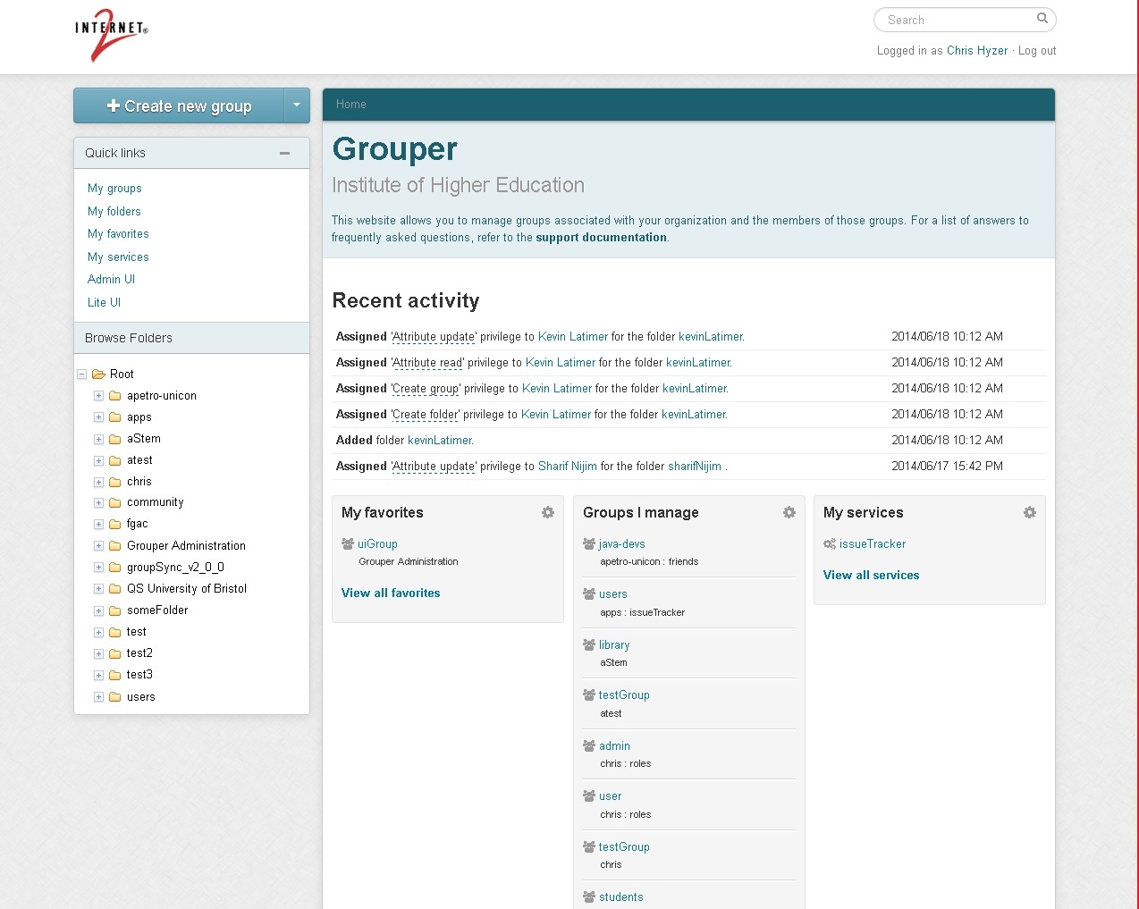
Linking
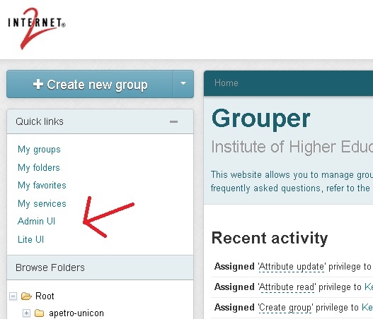
The new Grouper UI is linked to the Admin (legacy) UI and LITE UI and vise versa.
Search
There is a search box at the top right of the main 2.2 UI screen where you can search for entities, groups, folders, attribute definitions, or attribute names
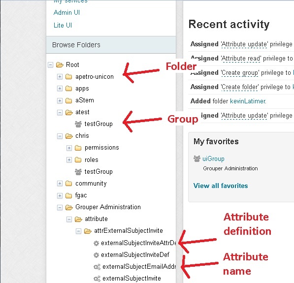
Tree browser
The tree on the left shows folder, groups, attribute definitions and attribute names. If you click on an item in the tree it will go to the main screen for that item. The folder is ajax based, it will retrieve the data as you click on items. It will only show a certain configurable number of items in a folder so there are not performance problems. The tree is secure, only items the user can see will be displayed. As edits to the registry occur, or as screens are navigated, the tree on the left will not change (so the user does not have to re-navigate). To repopulate the tree, click reload in the browser.
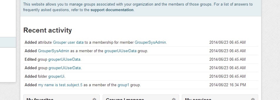
Recent activity
The main screen shows several line items of recent activity that the user has done. The user might need to do a similar function again and can easily find the required objects.
Quick links
The quick links on the left of the UI help the user quickly find objects they need to use. "My groups" shows groups the user can manage. "My folders" shows folders that the user manages. "My favorites" shows objects the user has tagged to be favorites. "My services" shows folders that are marked as services that the user is a member of or an admin of.

Favorites
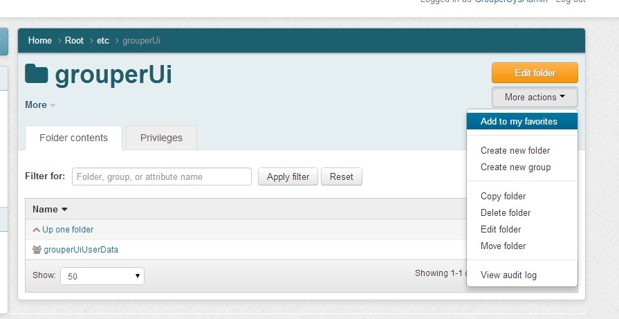
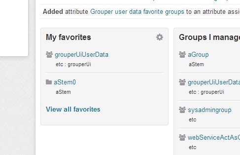
On the object screens (as of v2.2.0 this is the Group screen, Folder screen, and Entity screen), you can use the "More actions" button to add or remove that object from favorites. A short list of favorites is available on the main screen widgets, and a link is provided to see all of the favorites. If there are objects that the user uses frequently, "favorites" can help reduce the time needed to find those objects in the registry.
Here is how to add/remove an object from favorites
Favorites widget on the main screen
Favorites screen
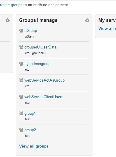
Groups I manage
There is a widget on the main UI, a page linked from the widget "View all groups", and a link from the "Quick links".
Quick links on main page:
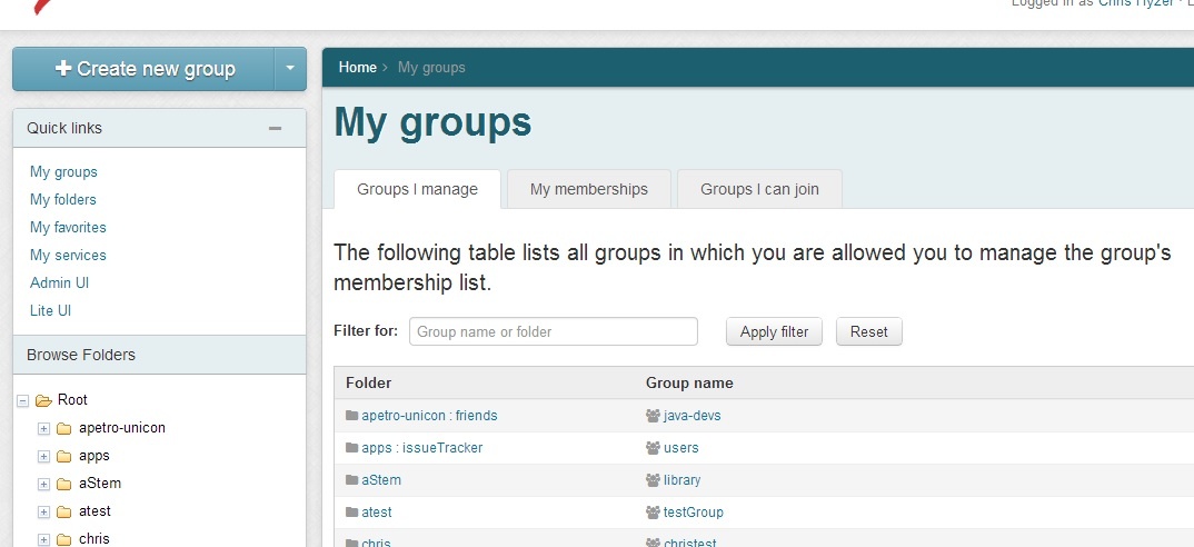
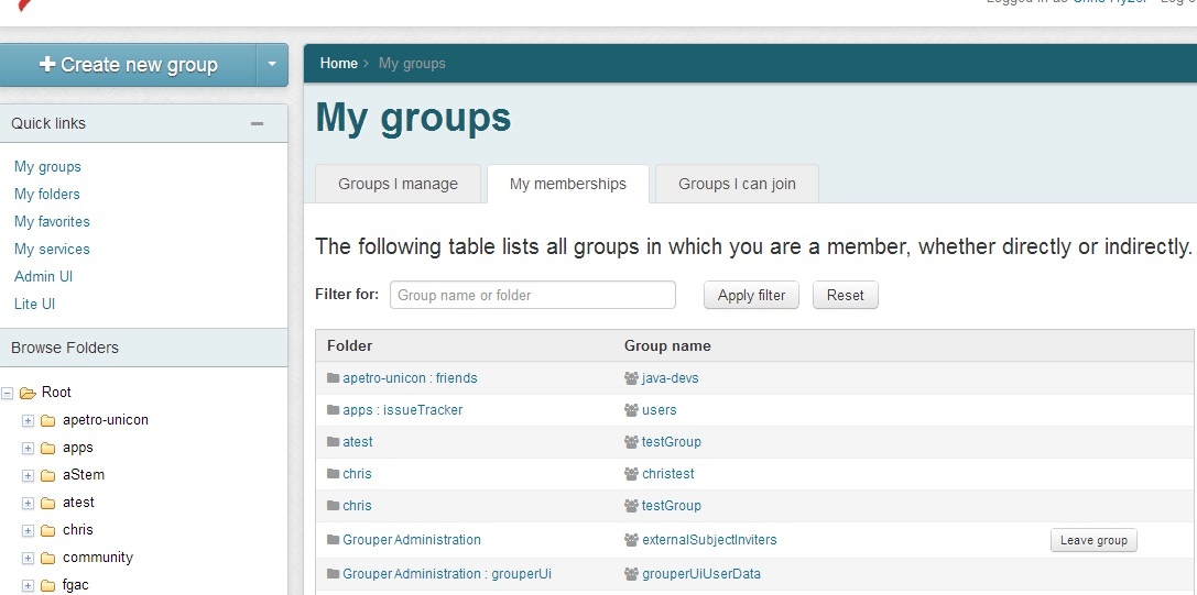
My groups
These tabs show groups that the user is a member of, has privileges on, or can join
Groups I manage
This tab gives a paged, sorted, and searchable view into the groups the user can manage. These are groups that the use has UPDATE or ADMIN privileges on.
My memberships
The "my memberships" tab shows groups that the user is a member of either directly or indirectly. Note, if you have privileges to leave one of the groups (ADMIN, UPDATE, OPTOUT), you will see a button that allows you to leave the group.
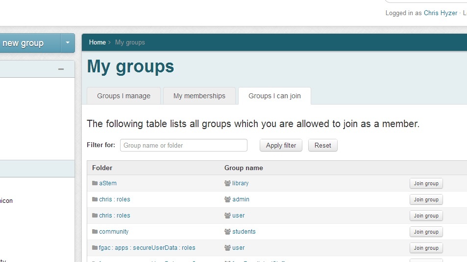
Groups I can join
The "groups I can join" tab shows groups that the user is not a member of but which they are allowed to add themselves to. This means they have ADMIN, UPDATE, or OPTIN privileges on the group.
My folders
These tabs show folders the user can manage, folders with groups the user manages, or folders with attributes the user manages
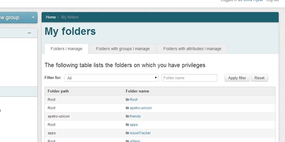
Folders I manage
This tab gives a paged, sorted, and searchable view into the folders the user can manage. These are folders that the use has any privileges on.
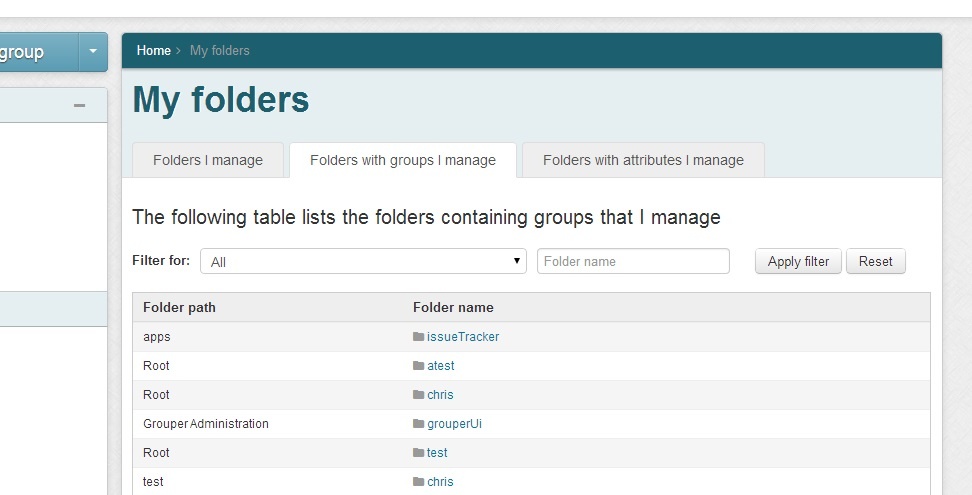
Folders with groups I manage
This tab shows folders that contains groups that the user manages. This means the user has UPDATE or ADMIN on the groups
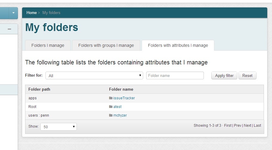
Folders with attributes I manage
This tab shows folders that contain attributes that the user manages. This means the user has ATTR_UPDATE or ATTR_ADMIN on the attributes
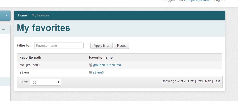
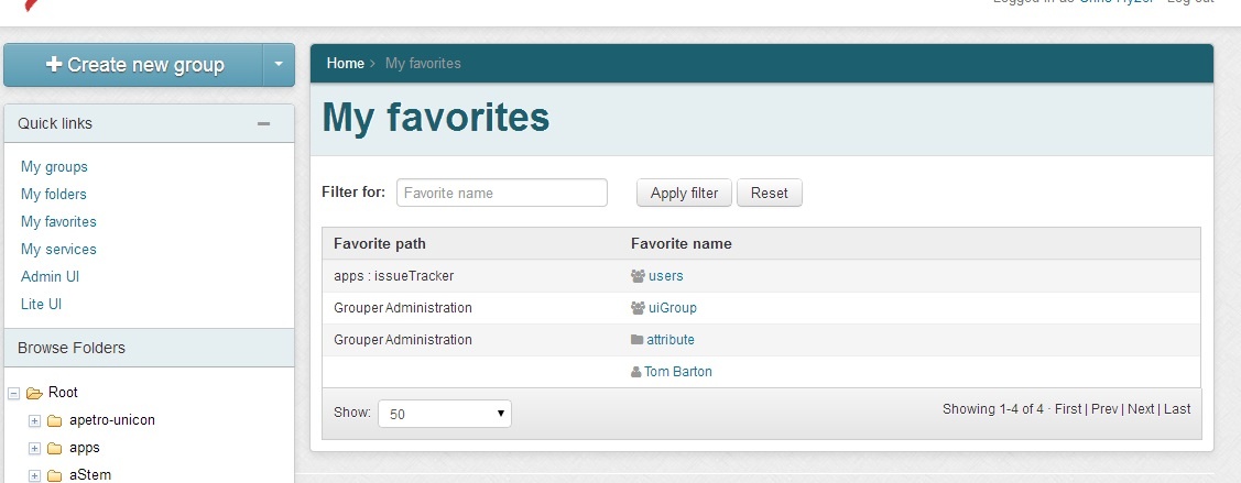
My favorites
The "my favorites" screen shows all the objects in Grouper that the user has marked as a favorite. Initially this is just Groups, Folders, and Entities (e.g. people), but eventually will also cover attributes and permissions. This list is paged, sorted, and searchable. This screen is accessed from the Quick Links list on the left of the UI.
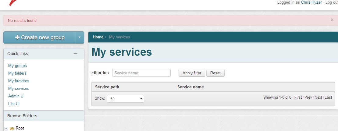
My services
The "my services" screen shows all the services in Grouper (a special attribute on a folder) where the folder contains groups that the user manages or is a member of. This list is paged, sorted, and searchable. This screen is accessed from the Quick Links list on the left of the UI.
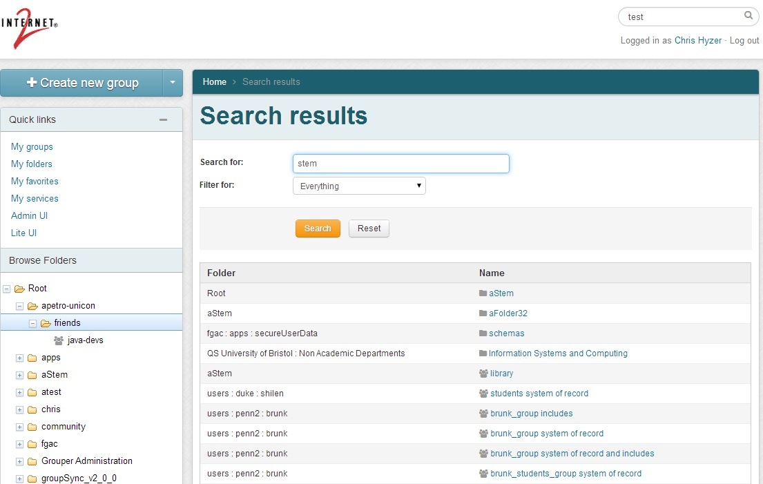
Search
The search function of the new UI is accessed from the top right of the UI. This will submit to the search screen. This search screen can filter in 6 areas: all object types, groups, folders, entities, attribute definitions, attribute names. The results are organized by object type and paged.
New group
The "new group" screen creates a new group in a specified folder in the Grouper namespace. The "new group" button is in the upper left of the UI. The folder combobox will default to whatever folder is being accessed, but can be changed to another folder. The combobox will only show result folders where the user is allowed to create groups. Generally the group name and group ID are the same, so to save time and help with consistency, as the user types in the group name, the ID will be populated with the same text unless the user chooses to have them differ.
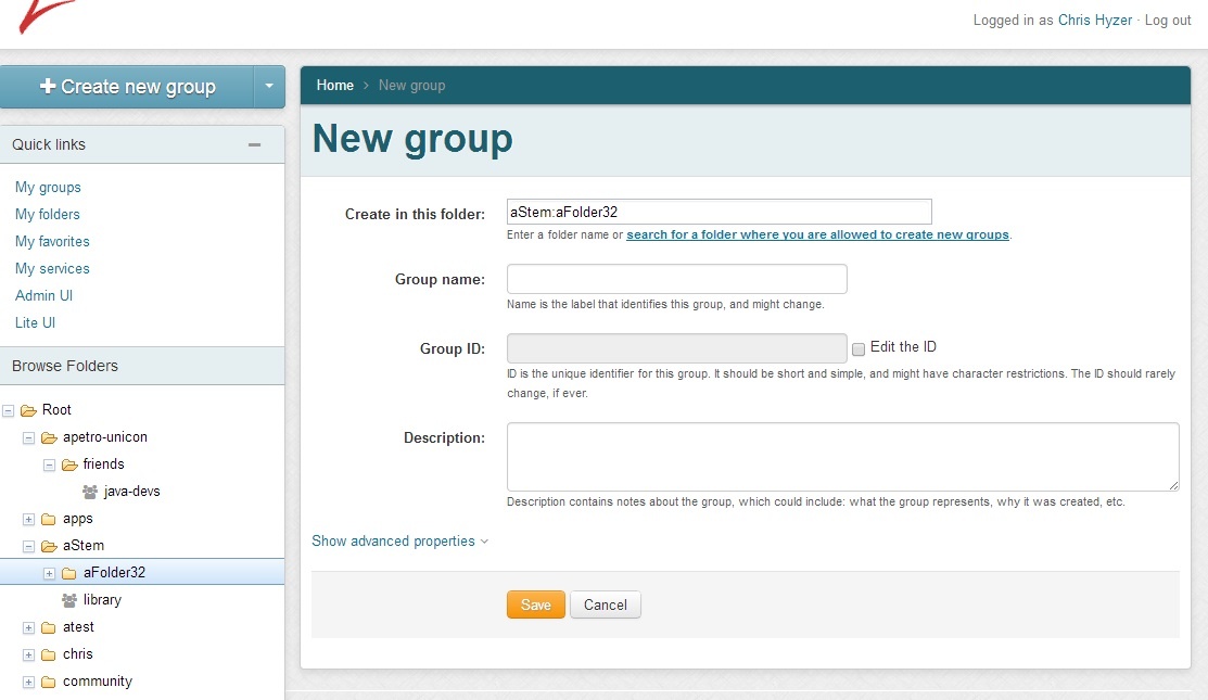
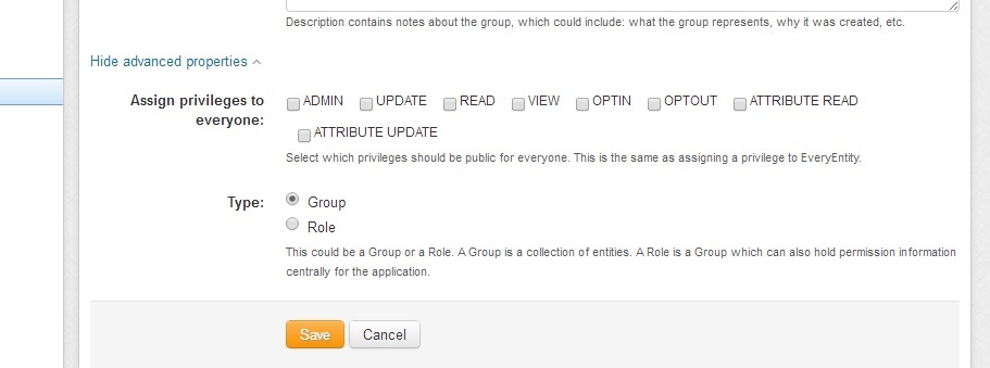
In advanced properties, a "role" can be chosen as the group type, and privileges can be assigned to EveryEntity so that all users can VIEW or READ a group.
New folder
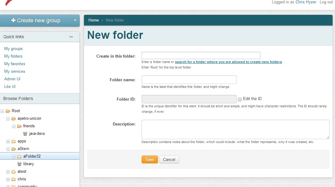
The "new folder" screen creates a new folder in a specified folder in the Grouper namespace. The "new folder" button is in the "new group" drop down in the upper left of the UI. The parent folder combobox will default to whatever folder is being accessed, but can be changed to another folder. The combobox will only show result folders where the user is allowed to create folders. Generally the folder name and folder ID are the same, so to save time and help with consistency, as the user types in the folder name, the ID will be populated with the same text unless the user chooses to have them differ.
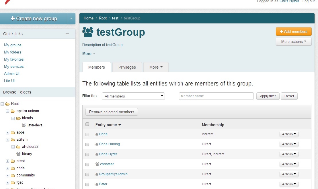
Group screen
The group screen is reached when a group is clicked on the UI. This could be in the menu, search results, or other screens that show groups. By default the group screen shows the group name and description and the members. The members tab of the group screen is sorted, paged, and filterable. It shows immediate or effective members of the group which could be groups or non-group entities.
Group add members
The "add members" button in the upper right will show a hidden panel which has a combobox to find members to add.
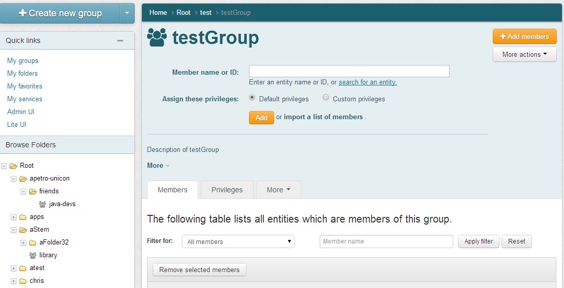
The combobox will show results of searches in subject sources. Groups are returned which the user can READ. The control can be controlled with the keyboard.
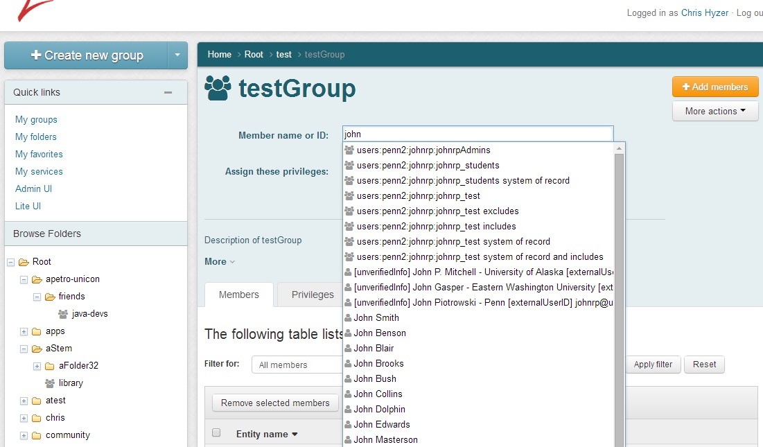
Members can be added with default privileges (member), or they can be given other privileges in addition or instead
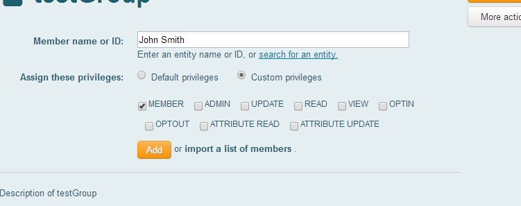
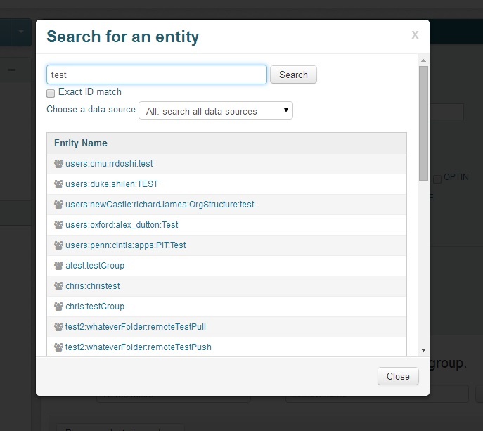
The user could use a modal dialog instead of the combobox. Note:a modal dialog can be used for any combobox in the new Grouper UI.
Group member action
For each member displayed on the Group screen, there is an action pull down which will show buttons available to the user depending on the row and the privileges of the user using the UI.
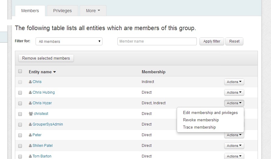
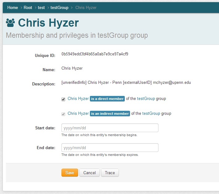
Group member edit membership
From the member action drop down, you can edit the membership. If it is a direct membership you can assign start and end dates
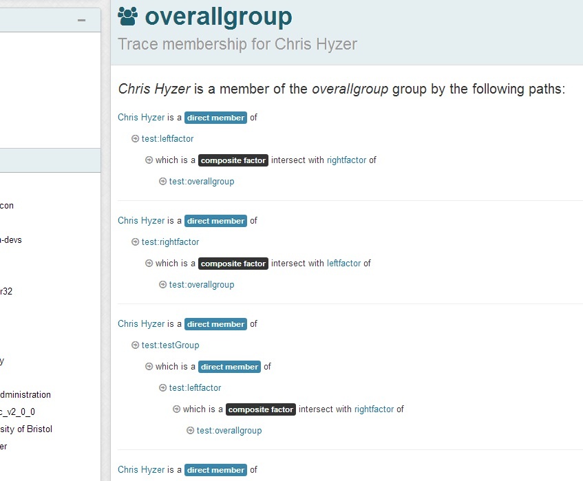
Group member trace membership
The membership trace is available from the actions drop down on the members tab of the group screen. You can see the path that a user has to the overall group. The trace screen will explain nested groups, composite groups, and privilege inheritance (when dealing with privileges).
Group menu
The group dropdown menu shows actions to perform involving the group. These are in a drop down so the buttons do not clutter the screen. The items in this drop down vary depending on the state of the group and the privileges of the user.
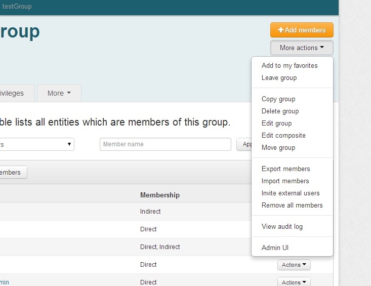
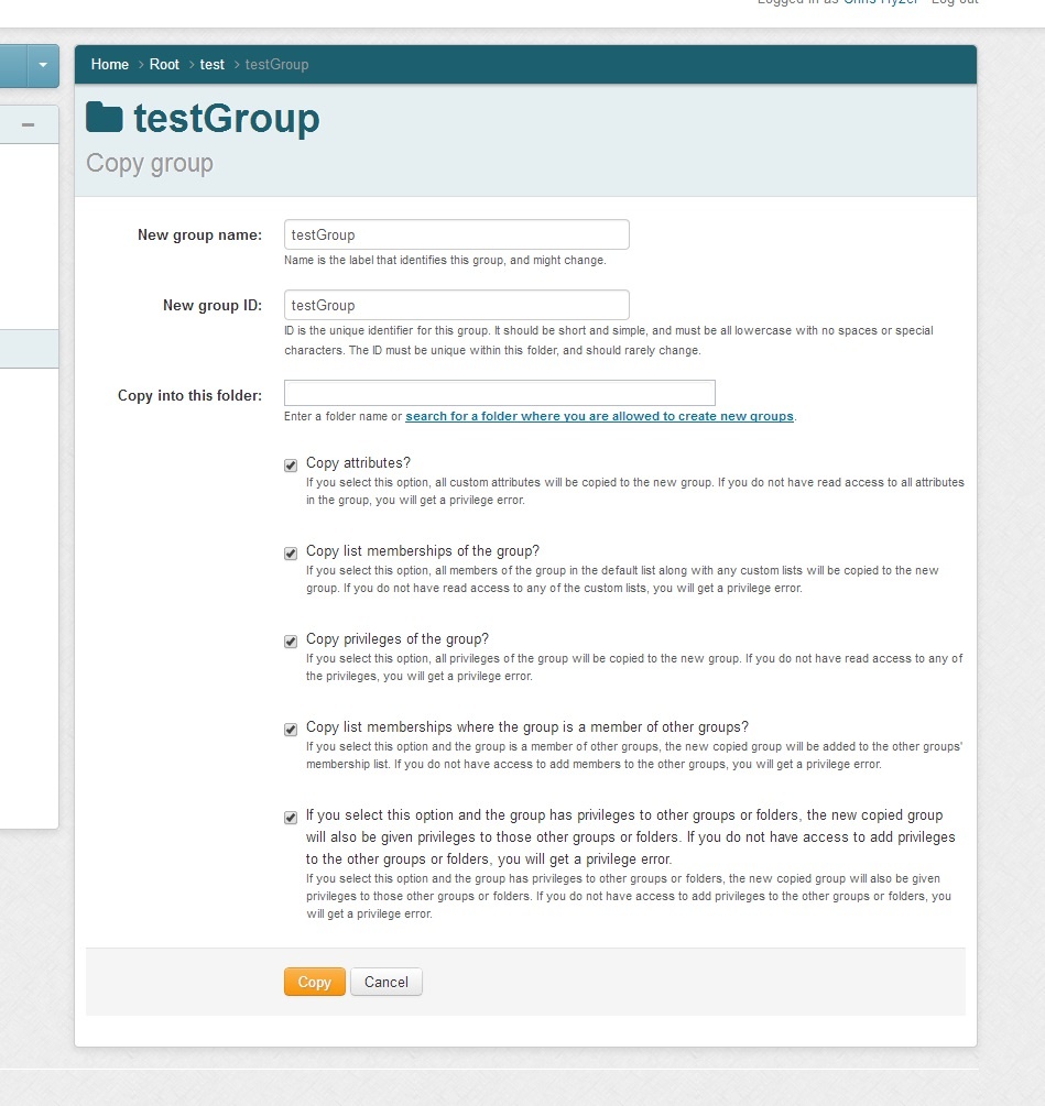
Copy group
You can select "Copy group" from the group menu to copy a group and optionally its members, privileges, and attributes to another folder